Showing posts with label vintage. Show all posts

Friday, July 31, 2026

Magical Fuchsia

Greetings, friends!  How about wrapping up the week with some fuchsias?  Spellbinders Layered Magical Fuchsia embossing folder and stencil to be exact.  After my first attempt at stenciling was a big flop, I decided to simply emboss and then color with Copics.  It's brighter than I had intended, but still pretty.


Hammermill 100 lb white, Spellbinders Essential Arches,
Brutus Monroe Spring Splatter Designer paper

I added a retired Power Poppy sentiment and a few clear gems, and brushed the arched panel with SU Soft Sky and Certainly Celery. 


*********

Pictured below is the only halfway usable picture I managed of Stenciling Attempt #2.  I followed my friend Pam's lead for the second card.  I embossed first, then stenciled, but still didn't like it so I brushed over the image with brown ink -- SU Creamy Caramel.  Not the same ink Pam used, and I went a lot darker because I was rather liking it.  Later I had to remove some of the ink from around the fuchsias by splattering water, then brushing with water and pressing with a paper towel.

I inset the gold sentiment and splattered the image panel with gold paint.  We'll call it vintage.  The cover panel is SU Blackberry Bliss.  I love that color, but have barely touched it.  I'm thinking I should use it more often.


Spellbinders Essential Stylish Ovals, sentiment from SB Stylish Oval Hello You Floral,
SB Infinity Punch & Pierce Plate


That's it for me and my Magical Fucshia today.  I'm working on more fuchsias for later.  Some other cards may come along first, though.  There are so many fun things in my use-next basket!

Have a magical day!


Wednesday, December 31, 2025

Vintage Rose

Hello there.  I've been a little off kilter recently, but today I'm treating myself to a visit with you, my crafty friends.  I have a card I made before Christmas, but didn't take the time to photograph and post.  Maybe I can get back on track now.  I was fiddling around with designer paper and the split front technique.  I added the band along the edge and it seemed to expand the design possibilities.  I do believe I'll be making more of these.


The patterned paper is an Amazon find via Pinterest ad from earlier this year.  I smudged the edges and sanded the paper to give it a timeworn look.  Untouched by time, however is the Penny Black Enchantingly flower.  I was testing out some new-to-me paper for Copic coloring and ink blending.  It's 100 lb Hammermill Premium Color Copy -- bright white and very smooth.  I love this paper and, let's get practical for a moment, the price point makes it all the more desirable.  Many of you are already using this particular Hammermill paper and know of its excellent quality.


I hope to see you again soon.  My apologies if I haven't been around to visit.  Things are just a little off here right now.  Please bear with me.

Happy new year to you!


Stamps:  Penny Black Enchantingly w/matching dies  Paper:  Hammermill 100 lb Premium, Bazzill hammered Herbal Garden Dark, designer paper from Amazon   Ink:  Memento Tuxedo Black, Stampin' Up Apricot Appeal for sentiment, Creamy Caramel to brush paper edges  Coloring:  Copics  Other:  Impression Obsession For You die, copper nail heads 

Thursday, July 10, 2025

Playing Along with the Colors of The Flower Challenge

Hello friends!  I've been meaning to get my Twinkling H20's out for some watercoloring.  Over time they've become one of my favorite watercolor mediums.  Those little pots of paint are full of some very rich and gorgeous colors!  I think they're off the market now, but there are other types of shimmer and glimmer paints that are pretty amazing.


I stamped Penny Black's Enchantingly in Ranger Archival Pale Ochre on Arches cold press watercolor paper.  Painted first, then cut with the matching die.  The designer paper is one of my newer pads by Brutus Monroe called Love Letters.  The whole pad is scripty, vintage, papery, double sided, semi-gloss, awesome, and perfect for backgrounds.  There is nothing about love apparent in the script so it can be used for any occasion.

The small envelope was made with my envelope punch board, and I inserted a note made with an old, neglected SU notepaper edge punch.  I drew lines with a pencil and stamped with Penny Black's Note Builder.

The colors were decided by The Flower Challenge.  I love this combo!  Even the paper fits the colors.


I can never capture the shimmer of Twinks in a photograph, but you can see the graininess of the mica flakes in the photo below.  I know you can imagine how it looks and feels in hand.


In addition to The Flower Challenge I would also like to share in two more challenges:

The Neglected Stuff Challenge -- Darlene and Diane encourage us to play with something we haven't touched in months.  It's probably been years since I've used my notebook punch.
NBUS Challenge #76 -- My never before used schtuff is the Penny Black Enchantingly stamp.


I'm so glad you could stop and visit when there's so much summertime activity to be enjoyed.  I'm heading out to the garden with my little helper, Sophie, as soon as I finish here.  It's looking lovely out there!  Have a beautiful day!


Stamps:  Penny Black Enchantingly, Note Builder  Paper:  Arches 140 lb cold press watercolor, Cougar Natural, Brutus Monroe Love Letters designer paper  Ink:  Ranger Archival Pale Ochre, Memento Tuxedo Black, SU Creamy Caramel  Coloring:  Watercolor with Twinkling H20's  Other:  Envelope Punch Board, notepaper punch, sequins

Monday, February 10, 2025

Blooms and Birds and Fixing Mistakes -- Four Cards

Hello there, and happy Monday!

My friend, Diane, inadvertently sent me on quite a creative journey when she posted this card for the Love Those Pretty Papers challenge.  Diane gives a link to a video and tells her story, saying it was a learning experience.  I'd say she's right about that.  I cut some pieces wrong, and then couldn't properly line up the ones I cut right.  However, I figured a way to fix my messes and piece together some different designs.  In the process I used four sheets from a 2009 BasicGrey 6x6 pad, as well as two not-yet-used Tim Holtz Sizzix die sets -- Bloom, Colorize and Feathered Friends.  I would not have thought of this paper/die combination, but one thing led to another.  You know how that happens, don't you?  I'll share in the order the cards were created.

In the first card I added a frame because my pieced papers came out with uneven edges.  The two ivory center panels helped separate the focal flowers from the busy background.


After I made the flower for the first card I was not eager to make that flower with its tiny parts again, so I pulled out one of the TH birds and combined it with foliage from the flower set.  I tried spacing the pieces as shown in the video, but ended up with too wide a space across the center of the card.  That's when I added one of the scalloped edges I'd cut from the paper.


For the third card I used another of the Feathered Friends combined with foliage from the flower set.  These patterned paper pieces were cut in the wrong direction (it's hard to explain) so I had to do a different design altogether.  I taped them together on the backside to create diagonal rows.  The prints don't line up, tsk tsk, but I'll live with that.  I added the crimped border to the card front and trimmed the patterned piece to fit.  This design is a little different, but it was Day 3 and maybe it's not so bad.


I was about to call it done, but I still had some pieces and I thought I really should have another go at the flowers.  That's my self discipline and waste not/want not philosophy nagging at me in unison.  It might be my favorite of the four.  Maybe I was just glad to be done.


The insides are all finished with bits of the paper to decorate.  Each card has Viva Cream Pearl Pen dots added.  Some I tapped the backside of the card to flatten the dots, some are left half-round pearl shape.

After all that... I'll be sharing in three challenges:

Love Those Pretty Papers -- Optional use red.
A Cut Above -- Anything goes with die cuts.
NBUS Challenge #71 -- Never before used schtuff.  That's my Tim Holtz Bloom, Colorize and Feathered Friends.


Thanks so much for bearing with me through all these cards and words.  I will see you again soon (I hope).  Take care and have a happy day!


Other dies:  Memory Box Wrapped Stitched Frames, Spellbinders Small Classic Ovals and Fluted Classics Rectangles, Creative Expressions Just for You set, Sue Wilson Creative Expressions Stacked Just Because


Saturday, January 13, 2024

Glazed Vintage Rose


Hello there!  I'm playing in another of Darlene and Diane's challenges today.  This one is Triple B -- Birds, Butterflies & Blooms.  Choose one or include all three.


I chose blooms because I love the frosty pink rose in the inspiration photo.  My rose is pink, but not frosty.  However I did add a touch of sparkle and an icy glaze.  I suppose I got a bit carried away.  Not sorry.  I dry embossed the Lisa Horton Peony Rose Stem on watercolor paper and colored with Tombow markers and homemade blender solution.  The soft stenciling in the background was mostly covered up with the wet embossed edging.  It was more edging than I'd intended but I decided to be okay with it and call it "vintage".


Continuing along the vintage lines, I smooshed the whole panel with Versamark ink and heat embossed with ultra-thick embossing enamel.  After it dried I bent and cracked it, then smeared with Memento Toffee Crunch ink to accentuate the cracks.  Wiped off excess ink.

The die cut sentiment is embossed with Ranger Enchanted Gold powder.  There is more sparkle to it than shows in the photo.  I shadowed the sentiment with brown cardstock then adhered to the glazed panel with Aleene's Tacky Glue applied with a plastic toothpick.


I've used this folder many times with and without the die and I think I like it best without.  After all this time I finally ordered more Lisa Horton 3D folders and hope to use them without delay when they arrive.  The best intentions... it's one of my plans for 2024 to not let the new things sit so long before I use them.

I'm happy this one helped with the Triple B challenge.  I'm thinking on which of Diane & Darlene's challenges I'll do next.  As you probably know, it's my personal goal to do all of them this month.  I'm not sure how that's going to work out but a girl can try and have fun doing it.

Thank you for visiting today.  I'll see you again very soon!


Stamps:  None  Paper:  Fabriano Artistico Extra White 140 lb hot press, Cougar 80 lb natural for card base and sentiment die + scrap brown layered under sentiment  Ink:  Versamark, SU Certainly Celery for stenciling, Memento Toffee Crunch for rubbing into cracks  Coloring:  Tombow markers and homemade blender  Other:  Lisa Horton Peony Rose Stem 3D embossing folder, Impression Obsession For You, Dylusions Leaf it Out Small stencil, embossing powders - Ranger Ultra-thick, Enchanted Gold, my own mix

Tuesday, August 16, 2022

Double D Challenge: Wheels

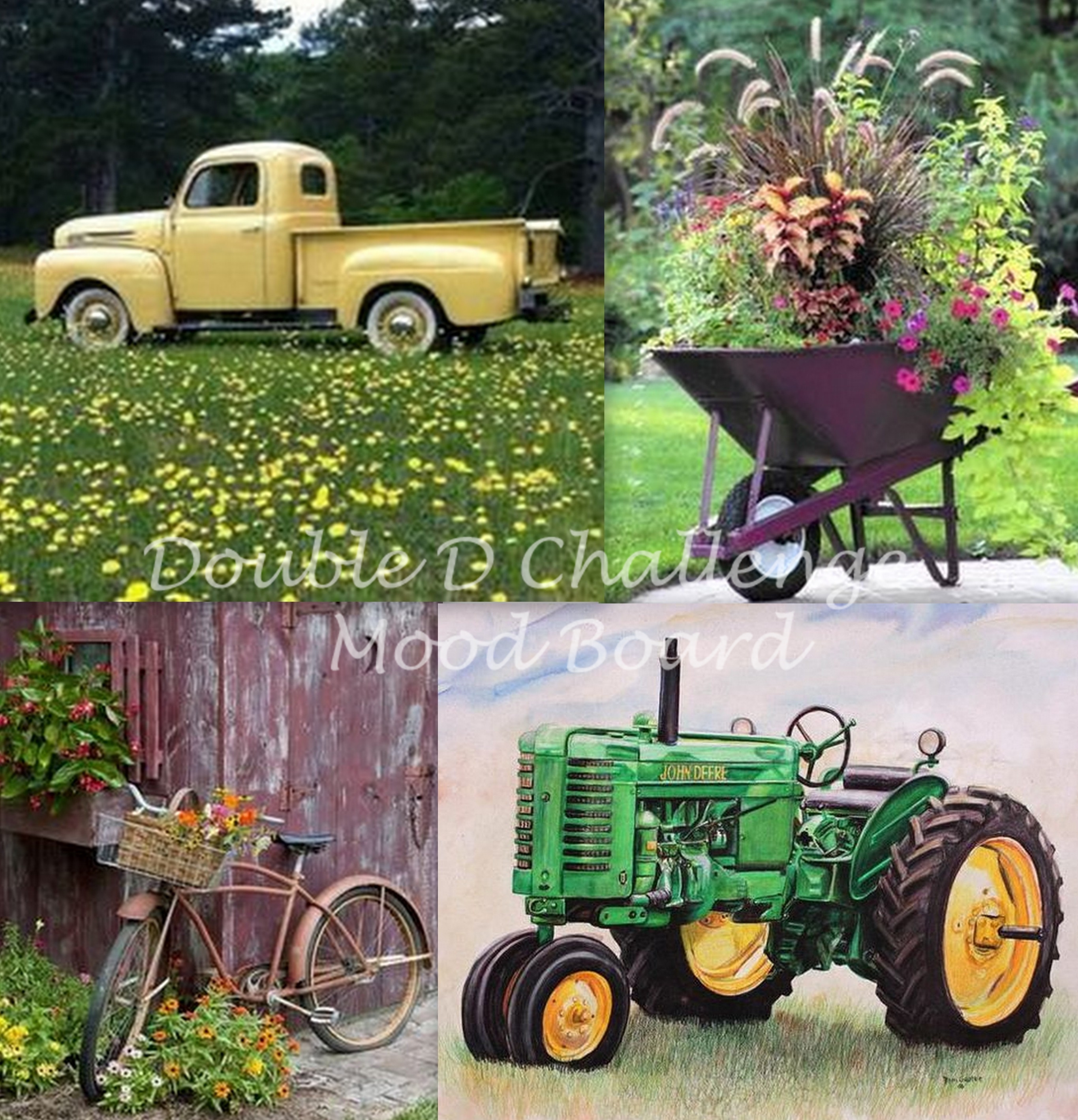
Hooray, it's time for another Double D Challenge!  This time Darlene is asking us for Wheels.  Anything with wheels -- and we're hoping you'll be inspired by this lovely mood board:


I'd like to be in each one of those pictures.

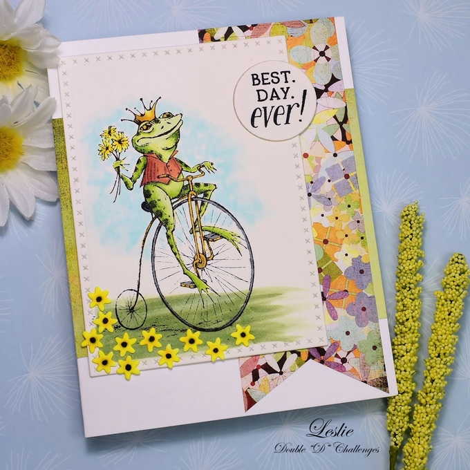
I chose whimsical for my wheels.  I've used another of my Inkadinkado woodblock stamps, not new on the market, but relatively new to me and never been used.  I stamped on watercolor paper and colored with Copics.  After looking at many different paper pads I settled on this old BasicGrey Kioshi.  I do have a few spare paper pads in my cabinet (ahem).  Must use the old along with the new.  I opened the pad and these pieces were already cut exactly as is so there's my layout.  You can barely see the green but it's peeking there along the edges.


All the little die cut flowers were scattered on the ground as a nod to the upper right inspiration photo.

We all would love to see you play along just for fun and possibly to be one of our creative winners.  You may even be the lucky random prize winner of this very cute die:


The team has some fun cards for you to see on the Double D Challenge blog.  I hope to see your project there too.  Wishing you the best day ever!


Stamps:  Inkadinkado Frog Prince, retired Power Poppy Best Day Ever sentiment  Paper:  Fabriano Artistico Extra White 140 lb hot pressed watercolor, Neenah 80 lb card base, BasicGrey Kioshi designer paper  Ink:  Memento Tuxedo Black  Coloring:  Copics  Dies:  Memory Box Crossed Stitch Frame Borders, Impression Obsession Tiny Flowers, Spellbinders Standard Circles Small

Thursday, February 3, 2022

A Card and an Update

Dear friends, first I would like to offer my thanks and gratitude for your support and kind words during this time that's been all upside down and backwards.  I hope I haven't missed emails or been unresponsive and, if so, please accept my most sincere apologies.

About Tuesday's MRI:  Happy dance!  It was the final word after an ultrasound and a CT scan left me unsure of my future.  As it turns out, all of my insides are perfectly normal.  Whew!  That was a crazy ride.  Let's not even talk about that anymore.  It's nice to have something to celebrate, isn't it?

I have a card to share today which I made... gee... a month ago maybe?  The stamp set was a Christmas gift and the card was sent to the giver as a thank you.


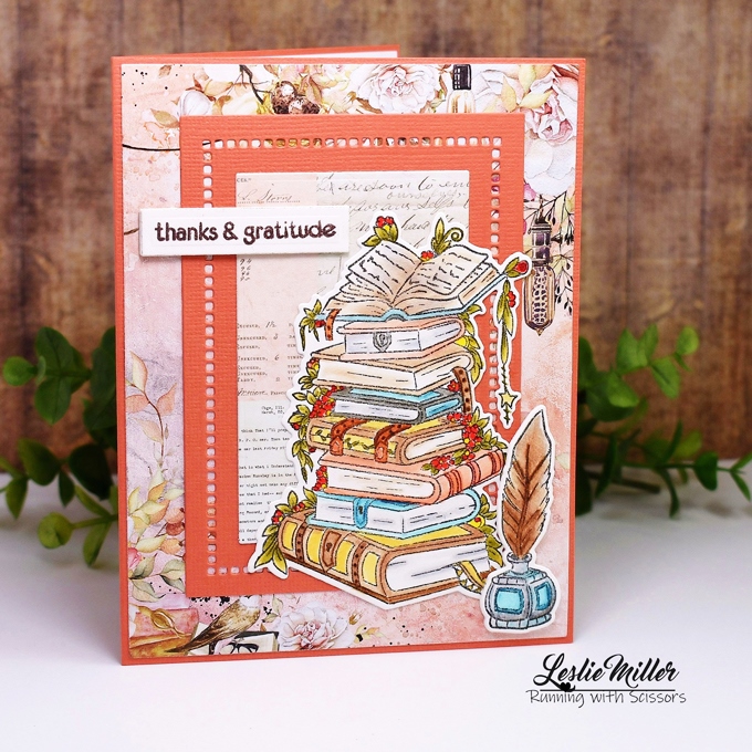
The set is Altenew's Books Are Magic.  Colored with Tombow markers and cut with the matching dies.  My friend knows me well -- I love books, love to color, and love when I have matching dies with a set.  I played with Mintay papers and chose all colors to coordinate with the papers.  The sentiment is actually from another Altenew set.  I'll list everything below.

I'll be trying to catch up with visiting in the coming days.  I'm so ready to get back to my happy place.  Have a wonderful day!


Stamps:  Altenew Books are Magic (with matching dies) and Wishing You (sentiment)  Paper:  Fabriano Artistico Extra White 140 lb hot pressed watercolor, coral textured cardstock, Mintay Dear Diary designer paper  Ink:  Palette Noir, SU Chocolate Chip for sentiment  Coloring:  Tombow markers  Other:  Spellbinders Hemstitch Rectangles, miscellaneous small rectangle die, Scotch brand foam mounting tape to pop up sentiment

Friday, November 26, 2021

Christmas Mouse

Hi!  My head is in the Christmas cards as I try to make progress.  How about something a little bit vintage today?  Goodnight Mouse is an older stamp I purchased a while back just so I could lay claim to a few of these Inkadinkado wood block art pieces before they disappear.


I stamped on watercolor paper and colored with Tombow markers -- no blender pen, just blending one marker into the other, light into dark.  I stippled white acrylic paint onto the pine bows and assembled with the bow and candy cane for decoration.

A lot went into the making of this card, but I'll limit the details here.  All info is in the recipe at the end.  I do want to mention the gold plaid background.  It's an oldie SU background stamp -- Flannel Plaid.  One day I sat with it and made several embossed backgrounds with different color cardstocks and embossing powders.  When the wet embossing had thoroughly cooled and set up I dry embossed with the SU Subtle folder for some additional texture.


Since Goodnight Mouse is new to me and it's a first-time use I'm going to share in Darnell's NBUS Challenge #32.


I hope all my US friends enjoyed a nice Thanksgiving in whatever way you spent it.  Now we head forward to Christmas.  Happy Holidays!


Stamps:  Inkadinkado Goodnight Mouse, Hero Arts From Our House sentiment, SU Flannel Plaid background (retired)  Paper:  Fabriano Artistico Extra White 140 lb hot press watercolor, SU Handsome Hunter, scrap red, gold glitter cardstock, Neenah 110 lb white for candy cane  Ink:  Palette Noir for mouse & sentiment, Versamark for plaid background  Coloring:  Tombow markers - no water or blender pen, red Copic on candy cane die cut, white acrylic paint applied to pine boughs with stipple brush  Dies:  Spellbinders Scored and Pierced Rectangles for plaid background, miscellaneous rectangle for main image, Poppystamps Lovely Gift Bow, Impression Obsession Pine Pair and Christmas Icons  Other:  Ranger Princess Gold embossing powder, SU Subtle embossing folder on card base and plaid background

Wednesday, July 28, 2021

Vintage Carnations

Hello!  I'm so glad to see you!  It's been a while since I sat down at the computer due to all the attention we've been focusing on the house and LuLu.  There's more to tell, but everything is fine and today I'm just going to share about card making.

Before I took my stamp room apart for the new floor I looked through my digi box to see what I might color while the room was inaccessible.  As it turns out, I've been too busy to color anything since I finished this card on July 2.  It is a free Carnations digital stamp from the Digital Two for Tuesday blog.  Post also includes a mum.  The illustration is from an 1893 book -- very vintage and yet as beautiful as ever.


I've always been fascinated with the transformation of this type of image.  You wouldn't expect it when you see the beginning.  The black disappears when it's done, and it looks like no-line coloring.  I used Copics for the coloring.


I covered the card base with some nearly vintage designer paper -- Scarlett's Letter by BasicGrey.  I loved this paper pack so much I bought two and have mostly hoarded it.  All covered up with a large image, you can't really see how pretty it is, but I hope to be showing more of it soonish.  I love the write up on the BasicGrey cover:  "Cause a scandal.  Get into some trouble.  Scarlett's Letter is a risque color combination of red, black, cream, and a touch of green blended into bold, courageous patterns.  Totally unique."


It will be difficult for me to create any new cards until I get my room in order.  Rich had a problem with the Stamping Command Center.  The large L-shaped desk had to be taken apart to remove it from the room but, alas, it broke in several spots and could not be saved.  I salvaged the two desk tops and hope to fashion some sort of work space with them.  Pictured below is the area where the desk used to be.


I know I'm going to go on another sorting and purging spree.  There's too much of something here, but I'm not sure yet what that is.

It won't be so long till I come back to visit again.  I have cards previously made, but afraid I'm falling short on some of my DT duties.  I know you all understand.  Sending good wishes full of love and happy to everyone!


Stamps:  Free digital stamp from Digital Two for Tuesday, Hero Arts Small Greetings, SU Itty Bitty Backgrounds  Paper:  Neenah Classic Crest Super Smooth Solar White 80#, black, BasicGrey Scarlett's Letter designer paper  Ink:  Printer, Memento Tuxedo Black, SU Going Gray  Coloring:  Copics  Other:  Sequins, stitching

Thursday, November 5, 2020

Mr. Foxy

I have a new obsession.  I was fooling around on Pinterest one day when up popped the most intriguing stamp image on a card.  Turns out it was a Woodware Lino Cut.  I followed the link and found a whole bunch of them at Frantic Stamper.  How did I not know about these stamps?  Where are all the samples?  After much searching I finally found a Woodware blog and from what I can tell, the company owners retired in 2016.  I think they're no longer making new designs, but the existing designs are still on the market.  I'm really not sure.  Does anyone know more about these stamps?

I now have six of the lino cut stamps and more in my wish list.  Once I started stamping with them I didn't want to stop.  Perhaps their style is not for everybody, but I'm totally smitten.  I started with Mr. Foxy because I wanted a fall card, and he seemed right for that.  Somehow the cards ended up with a vintage look, which is something I rarely do these days.  Things happen.  I tell you, I don't always have control of my own stamping.


I made two cards, both 5" square.  Frames are Core'dinations cardstock, sanded for aging.  The stamped panel on each is smooshed with Versamark and embossed with ultra-thick embossing enamel, two coats.  The image panel for this first card was put in the freezer for a short while so it would curl up and then crack when I straightened it.  When I learned this technique it was called "cracked glass".  I rubbed ink into the cracks, wiped off excess.  Vintage-ish paper behind it.  All part of the aging process.


The next card is similar, but different.  Frame is smaller, designer paper shows on the outer edges, different die cut in the corner.  Brushed ink around the edges of the image panel while the die was still in place.  Most significant is that I used a sponge dauber to ink the image in two different colors.


I knew these cards would be difficult to photograph because of the glossy coating, but it was even more so than I imagined.  While I was able to avoid the harshest glare, there is a haze over some areas that diminishes the crisp awesomeness I see with my own eyes.

Okay, I've taken too much of your time already, so I'll wrap up here.  See recipe below and have yourself a beautiful day!


Stamps:  Woodware Mr. Foxy  Paper:  Whisper White, Core'dinations brown, 7 Gypsies Conservatory designer paper  Ink:  Versamark and SU Really Rust (both cards), Apricot Appeal (1st card), Close to Cocoa and Creamy Caramel (2nd card)  Other:  Ranger Ultra-Thick Embossing Enamel, Die-namites Ivy Corner (1st card), Poppystamps Hampstead Corner (2nd card), Spellbinders Grand Classic Squares (both cards)


Sunday, January 20, 2019

New From Power Poppy: My Favorite Pair

Marcella's been drawing again!  She's released the second in her digital series of vintage cafe' au lait bowl bouquets and is it ever beautiful!  She calls it "My Favorite Pair".


Marcella's notes:

"A perfectly piled jumble of ripe pears, African violets, and meandering ribbon comprise the second in my series of vintage café au lait bowl bouquets. Think of the fun you can have with this one!  As we burrow into our winter wonderlands, the freshness of houseplants in windowsills is sometimes the only green to be seen!  Bursting forth with blossoms in purples and pinks, blues, reds, and whites — the coloring options are endless.  This illustration comes with an alternate version with a hand lettered sentiment, and a no-line version of each complete drawing.  Pick up Snowdrops and Tea Roses to complete the set, and look for another café au lait bouquet coming in February."


I printed the no-line, no-sentiment version on X-Press It Blending Card and colored with Copics.  I needed this to be a birthday card so I stamped a sentiment on the tag, somewhat wonky, but it was the only way it would fit.  I don't think the birthday girl will mind.

By printing slightly smaller than I normally do for digital stamps I was allowed room for playing with papers.  In fact, I started with the ribbon (must use it or lose it), then chose the papers, constructed the layout and, finally, colored to match.  This crafting progression always saves time in the end and makes it easier to choose image colors.  Decisions, decisions!


I added rhinestones, too.  All these things in my stamp room... I've already purged enough, so the remaining supplies must be used.  Vintage supplies for a vintage bowl.  Gosh, it's a pretty stamp!

See more of My Favorite Pair here:

Cheryl Scrivens
Broni Holcombe
Jennifer Dove
Marcella at the Power Poppy Blog

Thanks for dropping in.  Enjoy your day!