Showing posts with label Woodware. Show all posts

Monday, July 10, 2023

Clematis

Hi everyone!  I made a card for a purple-loving birthday girl.  On screen it appears more blue-violet, but to the best of my recollection it was as purple as all get out.  Ah, well, life is too short to worry about such things.

It's a Woodware stamp called Clematis Trio, stamped in Versafine Onyx Black and clear embossed.  I watercolored with Tombow markers.  A clean design.  The sentiment is an oldie from Stampin' Up.


White acrylic paint was used for the anthers.  Iridescent sequins for embellishment.


Do you ever feel like you have enough not-yet-used stamps, dies, and what-not to last you the remainder of your days?  That's me.  It's so easy to be tempted, but I really need to hold off the shopping for a while.  Famous last words, right?

Before I close I'd like to thank everyone for your kind comments on my post and in emails and cards regarding our LuLu's passing.  I'm still having a hard time and don't feel quite myself.

In the meantime, we celebrated our Wally's 14th birthday on June 27th.  Like most big dogs, Golden Retrievers don't have a real long life span and we always said we'd be happy if he made it to 14.  Well, here he is, not as perky as he once was, but still loving life and making us smile.


Thanks for coming to visit.  It really means a lot to me.  Have a good day!


Stamps:  Woodware Clematis Trio, SU sentiment (2001)  Paper:  Fabriano Artistico Extra White 140 lb hot press watercolor, purple textured (either Bazzill or SU)  Ink:  Versafine Onyx Black  Coloring:  Watercolor with Tombow markers plus white acrylic for flower anthems  Other:  Detail clear embossing powder, iridescent sequins

Sunday, January 8, 2023

Pink and Gold Floral

Hi there!  Getting right down to it... I felt inspired to create for two challenges.  It's the same Woodware stamp I used on the black watercolor card, but the look of it here is entirely different.  Both cards were embossed in gold and colored with Twinkling H2O's... the difference in the outcome is striking.  The other was impactful, this one gives the eyes a chance to rest.


Just two colors -- pink and gold.  I had to dilute the pink quite a lot to lighten the color, therefore it lacks shimmer.  That's okay because there's plenty of shimmer in the golden leaves.  The card is 3 3/4 x 6 3/4".  I guess I'll call it a midi-slimline.

I used an ancient JustRite sentiment with a circle punch and made it into a tag.  The Wicker Weave embossing is an old folder.  I can hardly make a card without old meeting new.


The two challenges:

Color Hues Challenge #55:  Light pink and gold.  Such a pretty combo.
Can You Handle the Pressure:  Anything goes with an optional twist of snow (I did not use the twist), but the challenge is the reason for the dry embossed lower edge, and the card is better for it.


Thank you lots for stopping by.  I hope to see you here again soon!


Stamps:  Woodware Floral Wonder, JustRite A Warm Hello Set (retired & out of business)  Paper:  Fabriano Artistico Extra White 140 lb hot press watercolor, SU Whisper White  Ink:  Versamark  Coloring:  Watercolor with Twinkling H2O's -- Egyptian Gold & Pink Azalea  Other:  Ranger Princess Gold embossing powder, gold cord, 1 1/4" circle punch, Cuttlebug Wicker Weave embossing folder

Wednesday, December 28, 2022

Watercolor on Black

Hello friends!  I hope this finds you all happy and relaxed after Christmas.  I'm basking in the peace and calm that comes this last week of the year.  We had a minor wind storm that left the yard a mess of debris but this can be dealt with in due time.  We didn't even lose power.  As we watch the weather catastrophes on the news we're feeling very fortunate indeed.

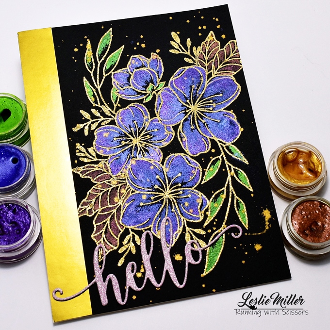
I've been enjoying some time in my stamp room and am thinking I'd better get a card posted while I have a chance.  Today you can see I've been at my black watercolor paper again.  My new flower stamp from Woodware is called Floral Wonder, and it is wonder-full with all that open space in the flowers and leaves which make it so nice for watercoloring.  There are limits to what you can do with the blending of metallic inks, but I'm trying out some possibilities.


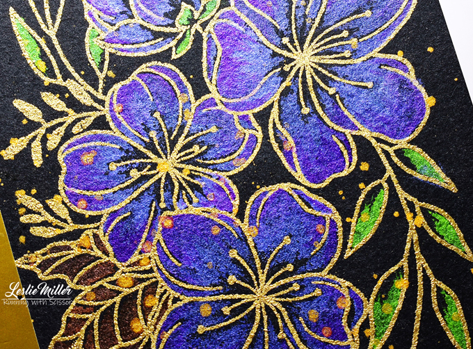
Working with metallics on black is an interesting experience.  I've used a higher concentration of paint for good coverage, and in this case I started at the petal and leaf tips and brushed inward, leaving black showing at the base.  At the tips of the petals I added a hint of darker purple, the effect of which is much more apparent as you move the card in your hand.  Just learning and playing.  My paints are the old-timey Twinkling H2O's.  There are some very pretty and fine quality pearlescent paints on the market which I may try someday.

The gold embossing is my usual Ranger Princess Gold, but even that looks different on the black watercolor paper.  Is it just me?  When heat set it does not raise up all smooth and sleek as you would expect.  Rather, it lays more flush with a grainy texture.  It's not a bad thing.  Just a whole other look.  Note that I'm using black watercolor 140 lb cold press as opposed to mixed media cardstock.  I'm sure each paper enables a different result.


I added gold splatters and didn't even make much of a mess this time.  I've made a note to self to leave the fan brush alone when it comes to splatters. 🙄

So there you have it, my second experiment with metallic watercolors on black.  It intrigues me and I will try again.  Have a fantastic day!


Stamps:  Woodware Floral Wonder  Paper:  Stonehenge 140 lb cold press black watercolor, gold satin metallic, pink glitter cardstock  Ink:  Versamark  Coloring:  Watercolor with Twinkling H2O's  Other:  Ranger Princess Gold embossing powder, Cottage Cutz Hello Phrase

Sunday, August 7, 2022

Joseph's Coat Ferns for CAS Mix Up

Hello!  There's a lot of busyness going on around the Miller residence these late summer days, but I wanted to take the time to play in the current CAS Mix Up Challenge.  It's hosted by my friend, Nancy, and she's asking for the emboss resist technique.  One of my favorites.

It occurred to me that the Joseph's Coat technique is totally emboss resist, but with a slight twist in that you ink a panel with multiple colors first.  I used glossy white cardstock brayered with an old SU Pumpkin Patch spectrum pad.  Stamped and clear-embossed my ferns, then rubbed Black Soot distress ink over that.  The results are rather striking.


To keep my card clean and simple I die cut a trio of small squares and laid them out on a 3 1/2 x 6 inch card (mini-slimline).  The card base was dry embossed with a wood grain folder, and as I positioned the center square I wove the golden fern tendril around it.  The fern die cut was pressed into my Versamark pad then heat-embossed with gold powder.  Added a sentiment and done!  Very easy.


The CAS Mix Up blog has several links to emboss resist tutorials.  As for the Joseph's Coat version, I learned from an old SCS tutorial here.  If you prefer videos check here for something really gorgeous.  Or search Pinterest or YouTube for hundreds of cards and tutorials.

CAS Mix Up -- Emboss Resist.  My mixed up media is stamping, heat embossing, dry embossing, die cutting.  Maybe the ink brayering is considered part of the mix up too.
NBUS Challenge #41.  My Woodware Ferns stamps are never before used schtuff.


I will leave you with a wish for a beautiful day.  Take care and stay cool!


Stamps:  Woodware Ferns, Hero Arts sentiment  Paper:  Glossy white cardstock, 100# Cougar vanilla  Ink:  Versamark, SU Pumpkin Patch spectrum pad (old), Ranger Distress ink Black Soot  Other:  Clear detail embossing powder, Ranger Princess Gold embossing powder, Sizzix Lumber 3D embossing folder, Spellbinders square dies, Memory Box Donnington Tendril die

Sunday, July 10, 2022

Things With Wings for CAS Mix Up Challenge

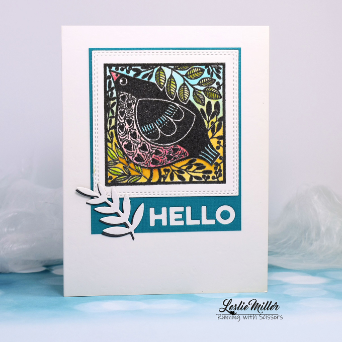
Hi there!  I'm glad to see you today.  I've done a little watercoloring for the CAS Mix Up challenge.  They're asking for "Things with Wings" and watercolor must be featured on the card somewhere.  My thoughts went straight to bird stamps because I've got a bazillion of them, and it just happens that the one I used today is seeing ink for the first time.  Yes, it's been in the basket for a while and, as always, I now wonder what took me so long to get around to it.


The stamp is from a Woodware set called Bird Blocks.  I love it.  There's another one in the set that's also very cool and interesting.  It looks black, but actually I stamped in dark gray, then over that with Versamark.  Watercolored with Tombow markers.  The dies are older from my stash and are listed in the recipe below.

Challenges:


Thank you for visiting, and thank you to all the good folks who encourage us through these fun challenges.  Have a super good day!


Stamps:  Woodware Bird Blocks  Paper:  Fabriano Artistico Extra White 140 lb hot press watercolor, Teal Bazzill, SU Basic Gray, textured semi-gloss white  Ink:  Ranger Archival Waterin Can, Versamark  Coloring:  Watercolor with Tombow markers  Dies:  Cottage Cutz Double Stitched Square Set, MFT Die-namics #captions, Dee's Distinctively Sm. Pair of Leaves  Other:  Detail clear embossing powder


Monday, January 17, 2022

Pup and Mog

Hi there!  It took a while, but I finally made it back to the blog after finishing some cards.  I used a NBUS Woodware set called Pup and Mog.  Who can say what attracts any of us to a particular stamp set or to any of the crafty things we buy?  All I know is that these simple open line images made me smile at the time and they still do.

The frolicking Pup was stamped in Versafine black and clear embossed.  I colored with Tombow markers, no water and minimal use of the blender pen.  Pulled a stenciled background and a watercolored frame from my bag o' backgrounds and created the base.  Added Pup and some die cut flowers.  I think he's happy!


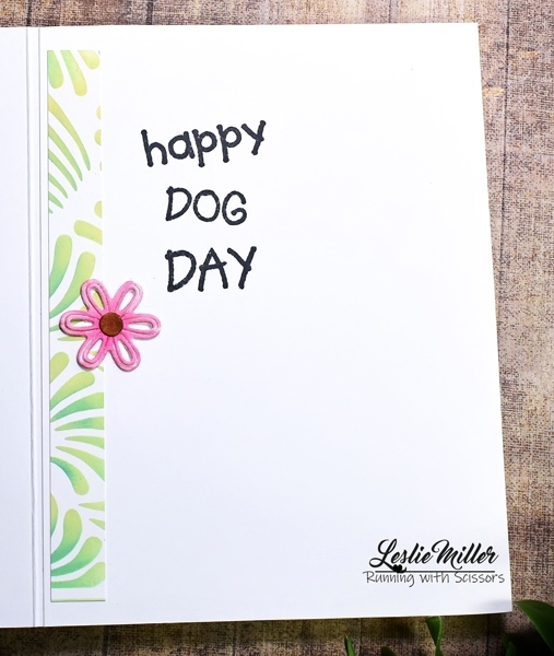
I saved the sentiment for the inside because it would crowd the front and I really wanted to say "happy dog day" to one of my doggy loving friends.  National and International Dog Day are both on August 26th.  Okay, so I'm a little ahead but might as well be ready.  Pictured below is the inside:


Mog, the cat, is relaxed and simply wishing a happy day.  It could be for anything, really.  I watercolored this one with SU inks and designed with some super old (2009) BasicGrey papers.  I inked up and stamped the cat's hearts a second time and colored, cut and glued over top to add just a tiny bit of texture.  One small gem for accent.


Editing to add my card to Darnell's NBUS Challenge #34 because my Pup and Mog stamps are fresh out of the package.


I apologize for not listing every detail, but it's probably not necessary.  I will mention that the fun stencil I used on the first card is from a large collection I found on Amazon.

I hope to pop in again soon.  I'm enjoying the time with Rich and Wally and LuLu, keeping options open as to how we spend our time.  I hope the new year is treating you well.  Hugs to all!


Wednesday, February 10, 2021

Chicken in the Grass

Okay... this one is just for fun because I wanted to try another one of my Woodware Lino Cut stamps.  With so much solid surface it can be difficult to get a good impression, especially with a clear stamp, but this came out usable with Memento ink and the MISTI.  It's called Chicken in the Grass.


My friend gave me the sheet of wood grain designer paper to help out with this card, and it was just the prompt I needed to decide which colors to use with the green.  A little burlap paper, a die cut greeting, and the Chloe Stem die to match...  I mean, really, how many different things can you do with a green square?  In the end I love it.  Stamped a birthday greeting inside (came with the stamp set), and tucked the card away in my birthday file.

Since my Woodware Chicken in the Grass stamp is fresh out of the package, I'm sending it over to Darnell's NBUS Challenge #23 (never before used schtuff).


Till I see you again... have a happy day!


Stamps:  Woodware Chicken in the Grass  Paper:  SU Whisper White and Blush Blossom, Neenah 110 lb white for die cuts, Craft Consortium wood grain designer paper, DCWV burlap paper  Ink:  Memento Bamboo Leaves, Copics B05 and R02 for coloring die cuts  Other:  Stickles Stardust Glitter, Cottage Cutz Greetings, Memory Box Chloe Stem


Wednesday, November 18, 2020

Lino Cut Wren and Framed Trees

Hello again in this busy card making season!  I'm doing my best to use my newest Christmas stamps, but some may have to wait till next year.  I did, however, want to have a play with my Woodware lino cut stamps, starting with Wren.  This was the stamp that caught my eye on Pinterest and set me on a Woodware lino cut journey.

There are actually 4 stamps in this set -- wren, sky, small tree, and sentiment.  So incredibly quick to make a card like this.  The image stamps crisply, but I did several stampings just for good measure.  SU Bashful Blue and Brilliant Blue inks with Brilliant blue cardstock for the base.  The stamping was done on SU Whisper White.  The snowflake die is one of three that popped out of the background.  Added a rhinestone, popped up the sentiment.  The square card is 5".


(Memory Box Stitched Circle Layers, Amy Design Keep it Cool Rounded Frame, Spellbinders Fancy Framed Tags One)

That was so easy I made another one, this time in SU Almost Amethyst and Lovely Lilac.  Stamped on Neenah Super Smooth, which is nice, but the image is more crisp on SU Whisper White.  Each paper has it's own value and purpose.  I love to color on Neenah, but cannot color well at all on Whisper White.  See more info below pic.  Can you see the texture of the lilac card base?  That's done with SU's Subtle embossing folder.  Love that thing!


(Precious Marieke Snowflake Border, Impression Obsession Small Snowflake Set, silver self-adhesive trim, rhinestones)

The next cards are made with a Woodware lino cut called Framed Trees.  Sorry, no link, but I have to tell you I had a little trouble getting a good impression with this one.  I tried first with the MISTI, then my old SU Stamp-a-Ma-Jig.

Best results came by stamping with Versamark and embossing -- that's the gold and black card.  I used my own embossing powder mixture which is rather chunky with gold and silver, something glittery, even a little yellow.  I've forgotten everything I put in it.  Just playing, you know.  Some of the stamp's detail was obliterated by the chunky powder, but still looks pretty cool (more so in person).  After I embossed the gold on black I let it cool and then smooshed with Versamark and embossed with clear powder.  A nice glaze.


The blue card is my first time to try embossing Distress Oxide inks.  It worked great, other than the parts of the stamp that did not impress well no matter how many times I stamped over.  I used Peacock Feathers.  One die cut snowflake partially covers the most flawed area, the other two snowflakes are just for show.

This is a lot in one post, I know, but I tried to be quick about it.  I'm in a rush to get Christmas cards done and still do my other stamping, as well.  It's all fun for me!  I hope you're enjoying your holiday season, even though things are a little weird this year.  Hugs all around!


Thursday, November 5, 2020

Mr. Foxy

I have a new obsession.  I was fooling around on Pinterest one day when up popped the most intriguing stamp image on a card.  Turns out it was a Woodware Lino Cut.  I followed the link and found a whole bunch of them at Frantic Stamper.  How did I not know about these stamps?  Where are all the samples?  After much searching I finally found a Woodware blog and from what I can tell, the company owners retired in 2016.  I think they're no longer making new designs, but the existing designs are still on the market.  I'm really not sure.  Does anyone know more about these stamps?

I now have six of the lino cut stamps and more in my wish list.  Once I started stamping with them I didn't want to stop.  Perhaps their style is not for everybody, but I'm totally smitten.  I started with Mr. Foxy because I wanted a fall card, and he seemed right for that.  Somehow the cards ended up with a vintage look, which is something I rarely do these days.  Things happen.  I tell you, I don't always have control of my own stamping.


I made two cards, both 5" square.  Frames are Core'dinations cardstock, sanded for aging.  The stamped panel on each is smooshed with Versamark and embossed with ultra-thick embossing enamel, two coats.  The image panel for this first card was put in the freezer for a short while so it would curl up and then crack when I straightened it.  When I learned this technique it was called "cracked glass".  I rubbed ink into the cracks, wiped off excess.  Vintage-ish paper behind it.  All part of the aging process.


The next card is similar, but different.  Frame is smaller, designer paper shows on the outer edges, different die cut in the corner.  Brushed ink around the edges of the image panel while the die was still in place.  Most significant is that I used a sponge dauber to ink the image in two different colors.


I knew these cards would be difficult to photograph because of the glossy coating, but it was even more so than I imagined.  While I was able to avoid the harshest glare, there is a haze over some areas that diminishes the crisp awesomeness I see with my own eyes.

Okay, I've taken too much of your time already, so I'll wrap up here.  See recipe below and have yourself a beautiful day!


Stamps:  Woodware Mr. Foxy  Paper:  Whisper White, Core'dinations brown, 7 Gypsies Conservatory designer paper  Ink:  Versamark and SU Really Rust (both cards), Apricot Appeal (1st card), Close to Cocoa and Creamy Caramel (2nd card)  Other:  Ranger Ultra-Thick Embossing Enamel, Die-namites Ivy Corner (1st card), Poppystamps Hampstead Corner (2nd card), Spellbinders Grand Classic Squares (both cards)